Dr. Renê Porto
Identity for humanised rheumatology
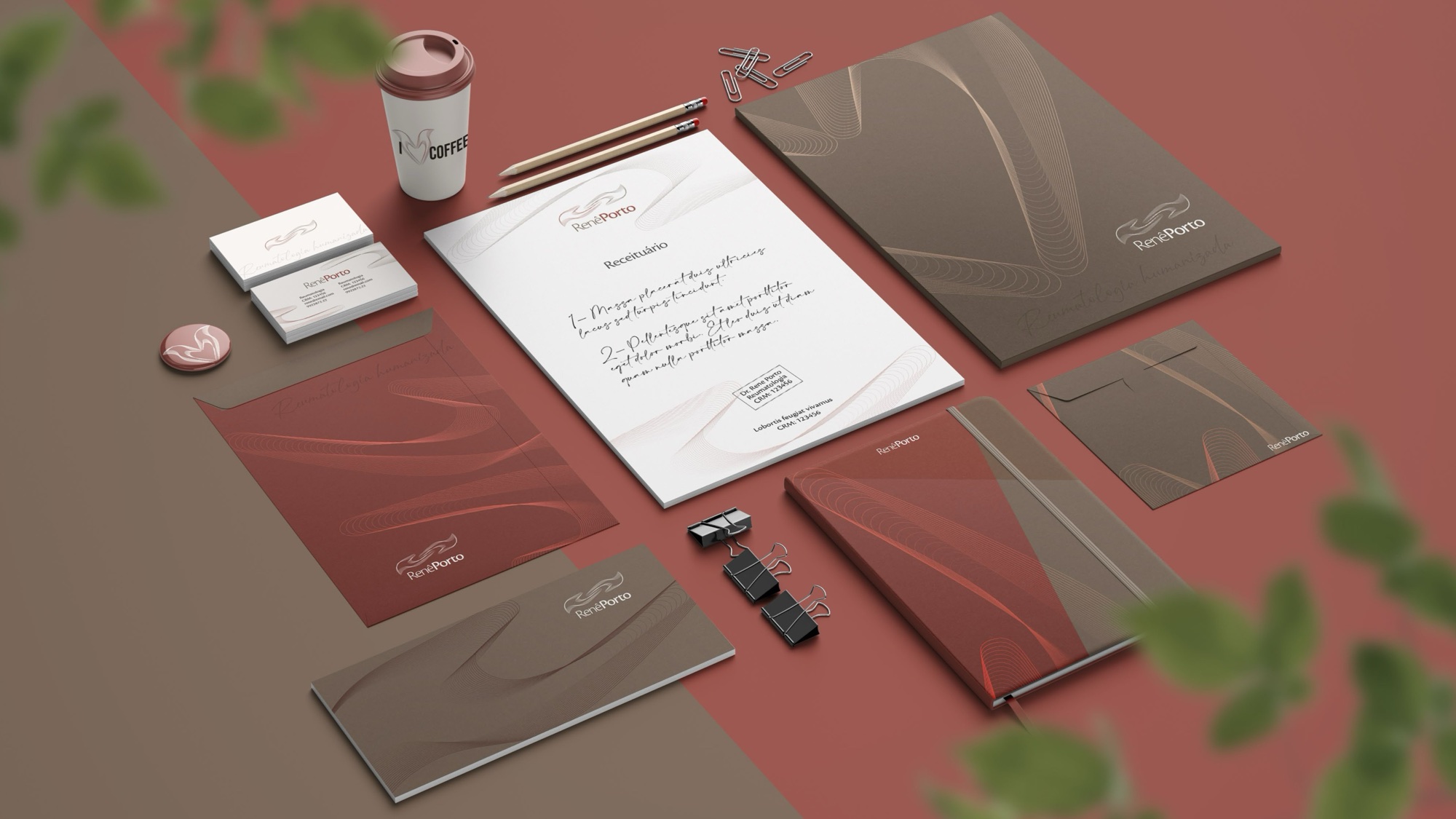
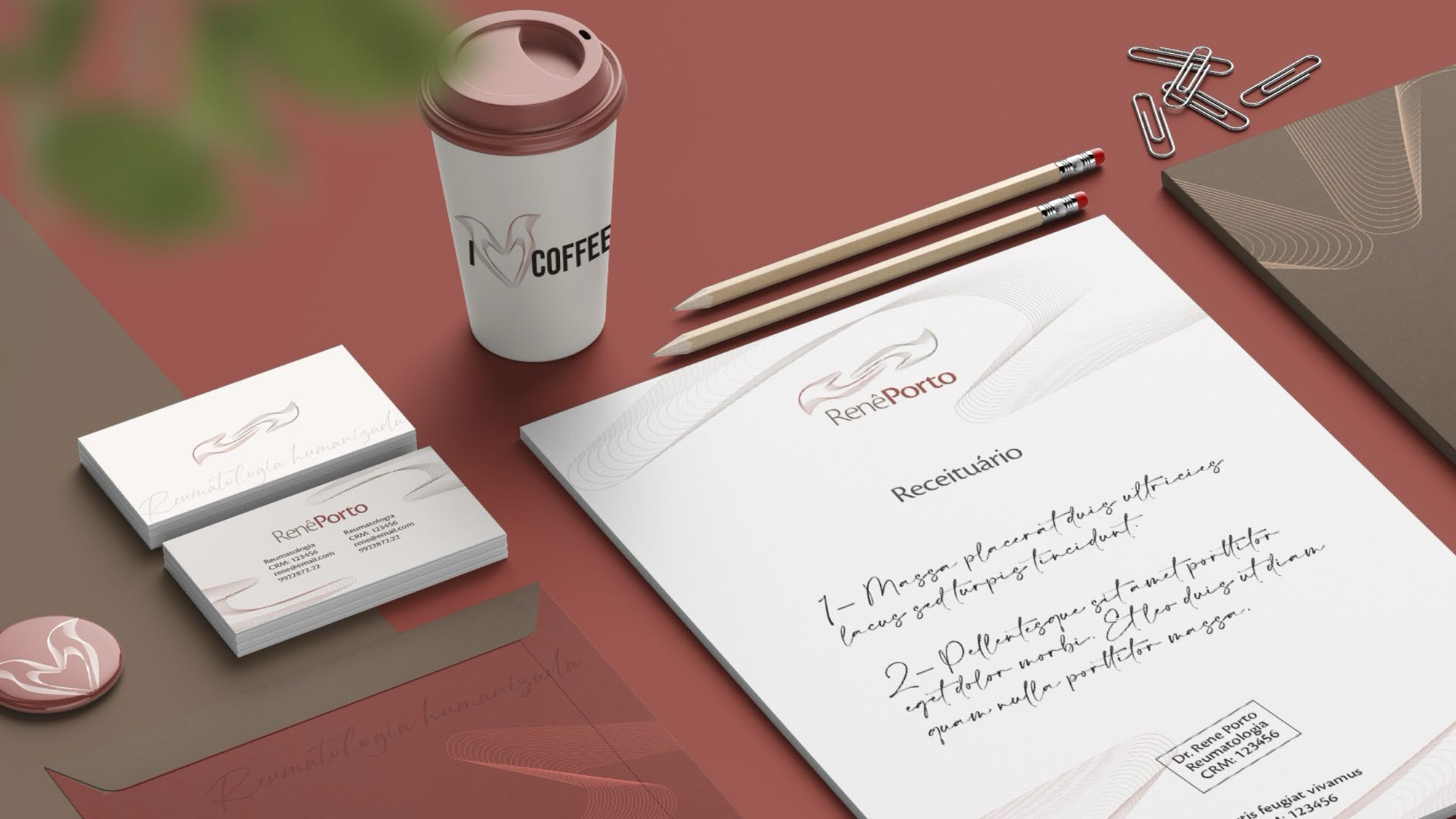
Dr. Renê Porto is a rheumatologist who wanted his brand to say what patients feel in his office: welcome. The brief words were clean, pastel, discreet and elegant.
Concept
Two hands reaching for each other, drawn in fine lines. His surname, Porto, means harbour, and the symbol is a reminder that his job is to be a safe one.
Voice
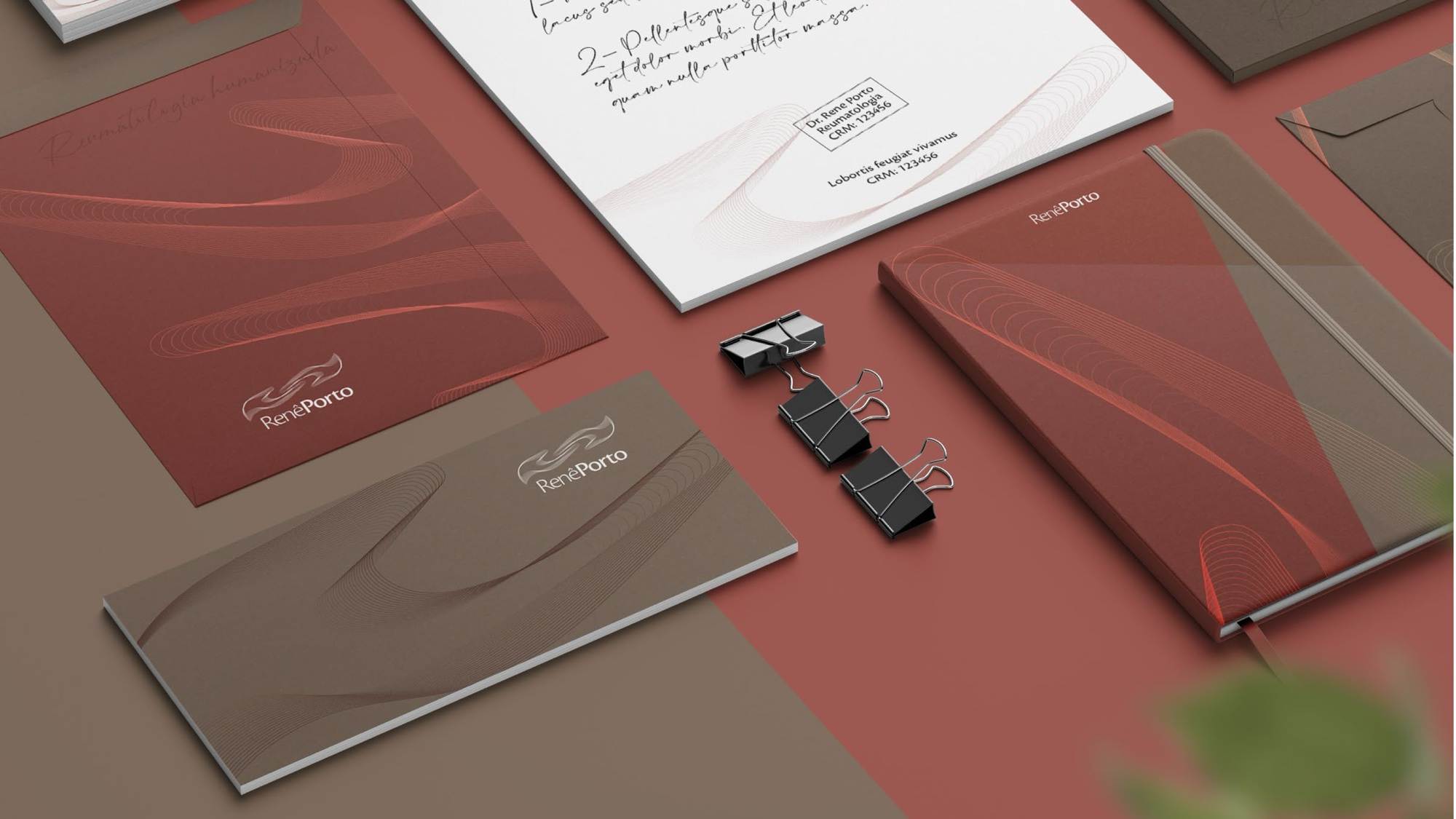
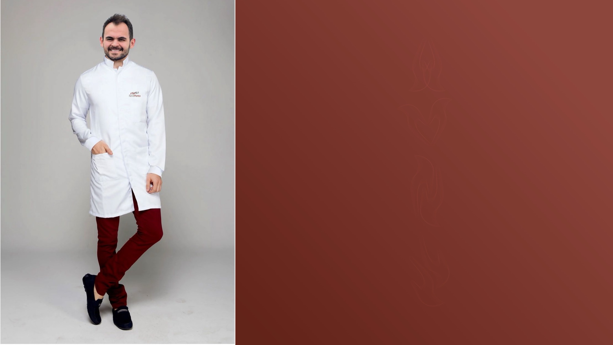
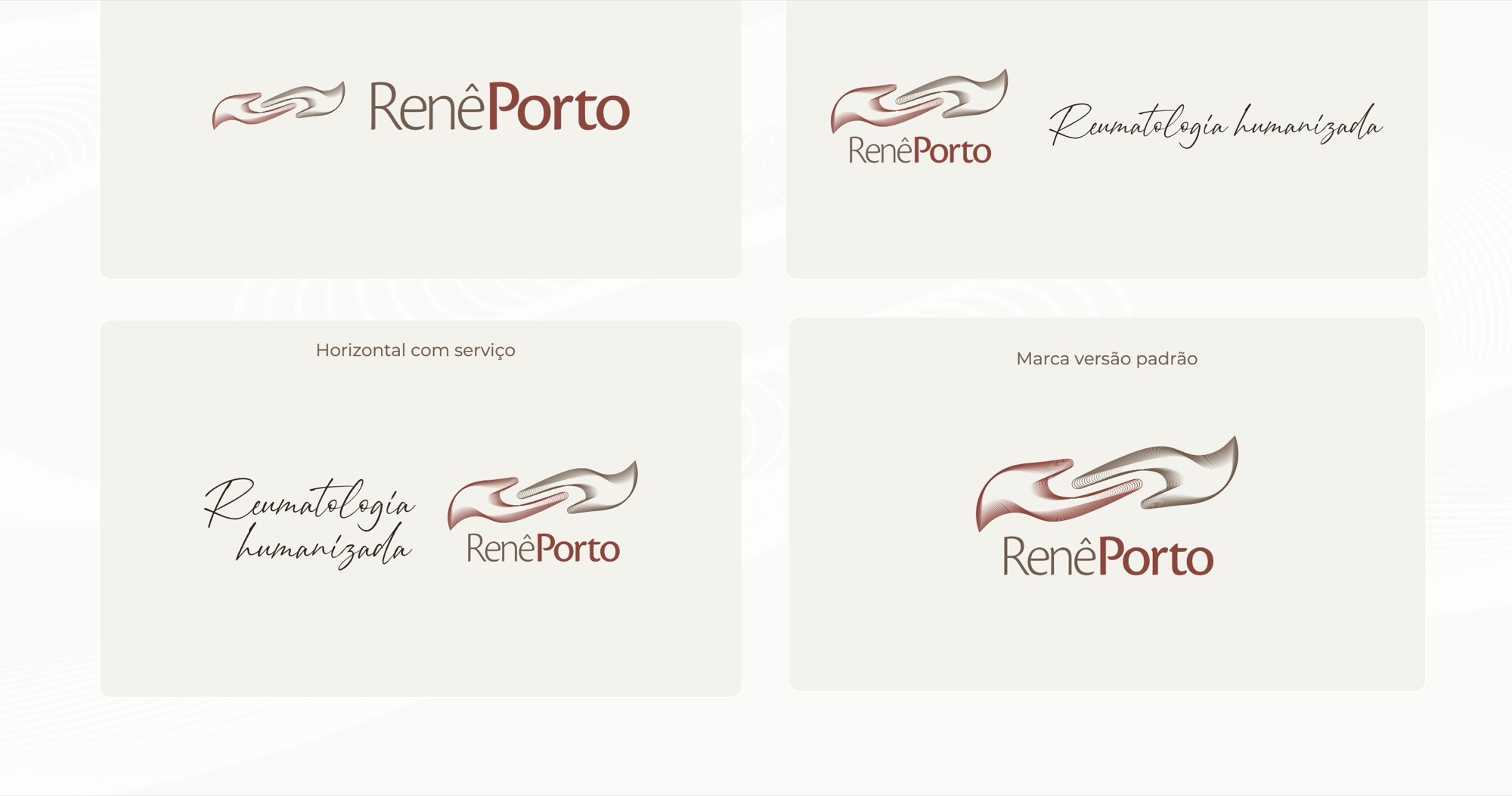
The line “Reumatologia humanizada” (humanised rheumatology) is set in handwriting, like a note left for the reader. The line work of the symbol also becomes a texture, and the photography is warm and close.


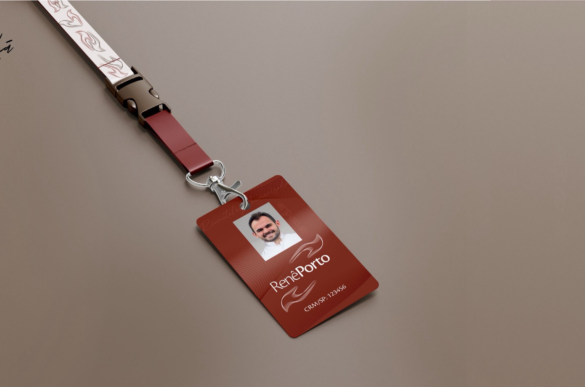
Applications