Jump
Rebranding for a boutique digital agency in São Paulo
Jump is a boutique agency in São Paulo that builds apps and digital solutions. Most of its work is done behind the scenes, as a supplier to larger companies. It had outgrown a logo that still carried the word “mobile”, and asked me for a rebrand that kept its orange.
Rebranding: before and after
The old wordmark described a product. The new one describes a way of working.

Positioning
Before drawing anything I defined who the brand is: experienced and practical, cheerful and creative, ethical, boutique without being conservative. I placed it on the Creator archetype, which promises originality and exists to innovate.
Concept
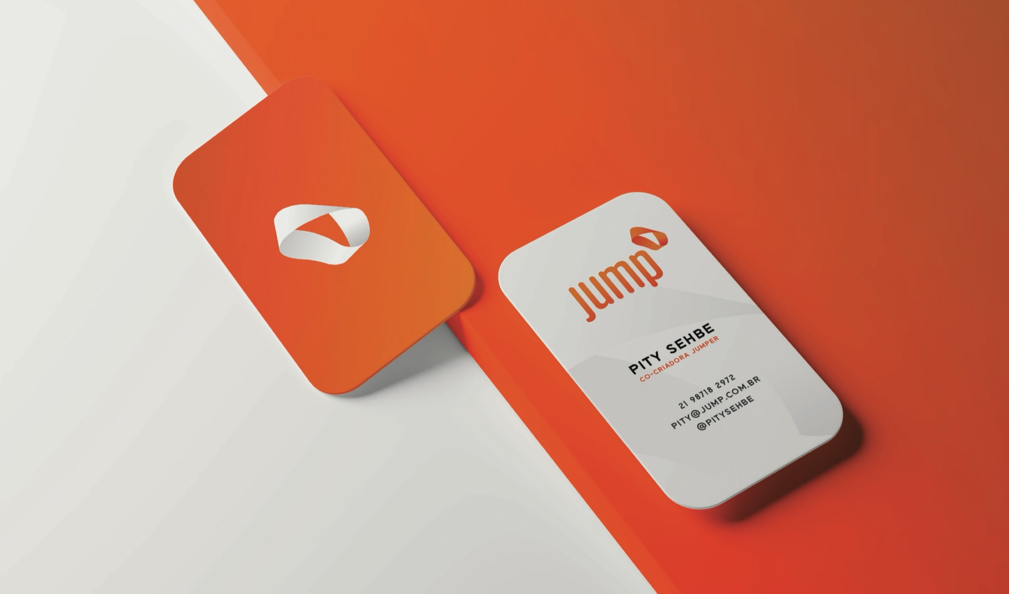
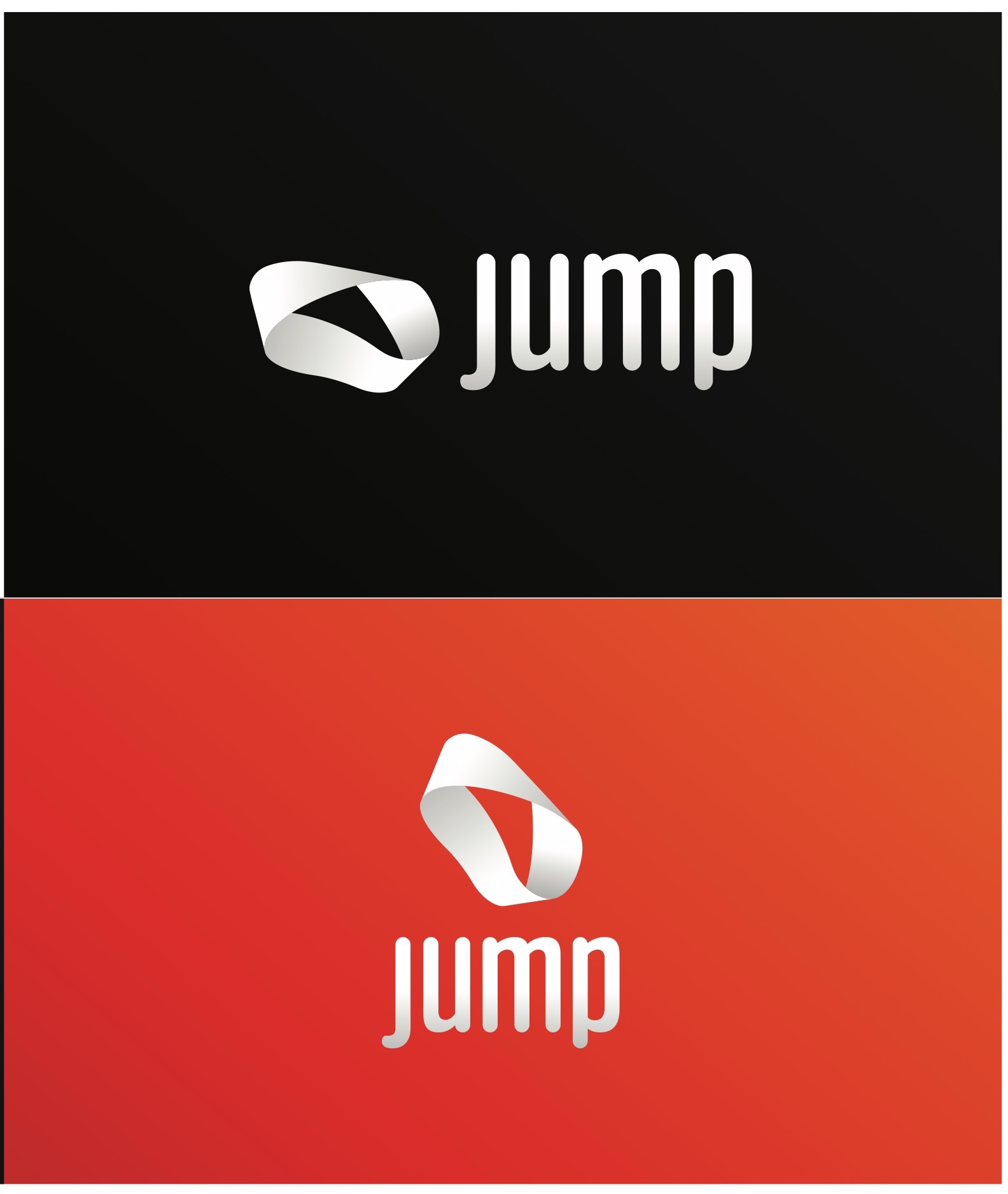
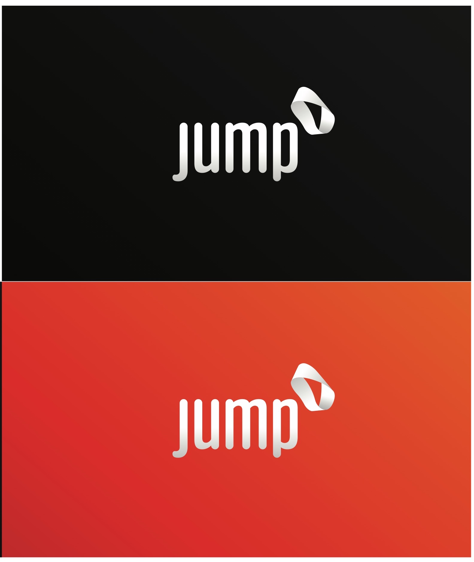
A Möbius strip has no inside or outside. It stands for fluidity and transformation, and for services that change shape as a client’s needs change.
Campaign Proposed in the brand guide
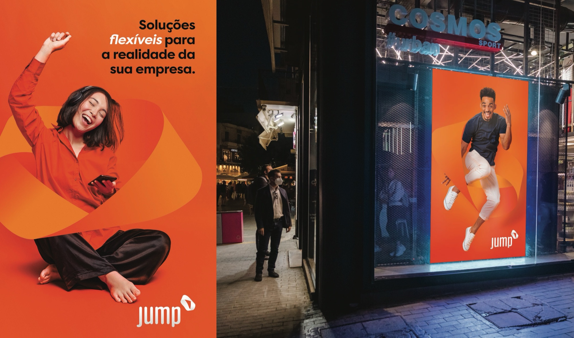
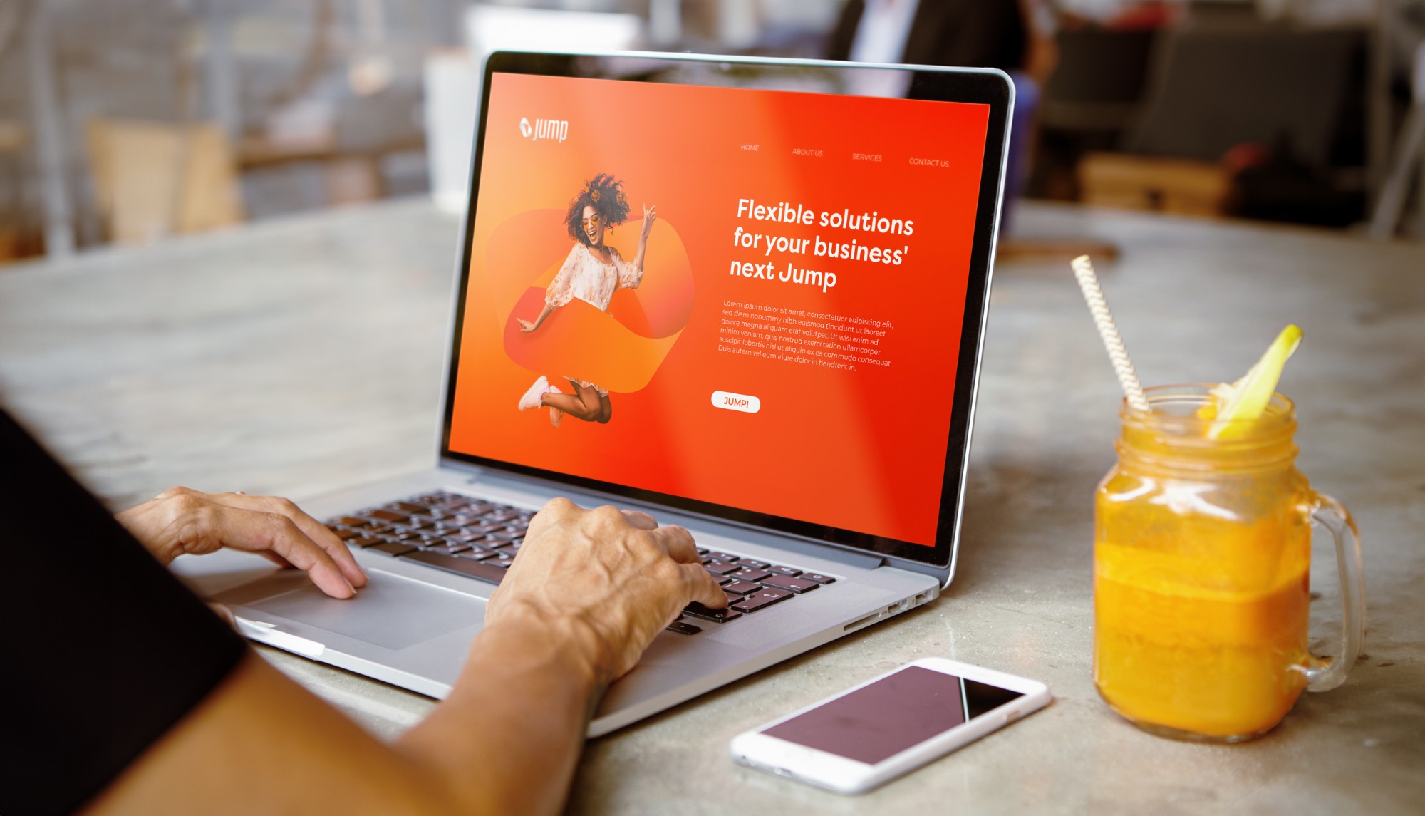
In advertising the strip becomes a ribbon that people jump through, under the line “Flexible solutions for the reality of your company”. The guide shows the idea on a website, outdoor, print and business cards.