Picnic
Rebranding proposal for a Brazilian fintech with a crypto audience
Picnic is a Brazilian fintech for exchanging and spending money in dollars, with an audience of crypto users. Another brand raised a legal issue over visual similarity, so Picnic needed an identity that was clearly its own, and a way of communicating that could scale across marketing. This rebranding was a proposal and did not go ahead.
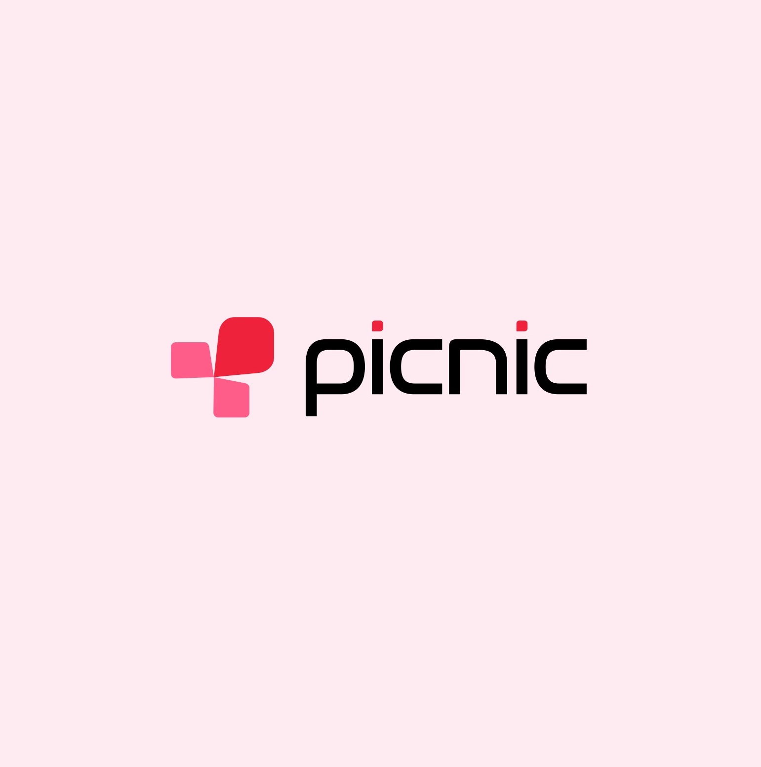
Rebranding: before and after
The identity in use sat too close to other players in the market. The proposal on the right was not adopted.
What had to change
The brief had two parts. The identity had to move away from the brands it was being confused with, and it had to work as a system, so that marketing could keep producing without redrawing the brand each time. I set the direction as human, clean and digital-first: more personality, less generic fintech.
System Proposal
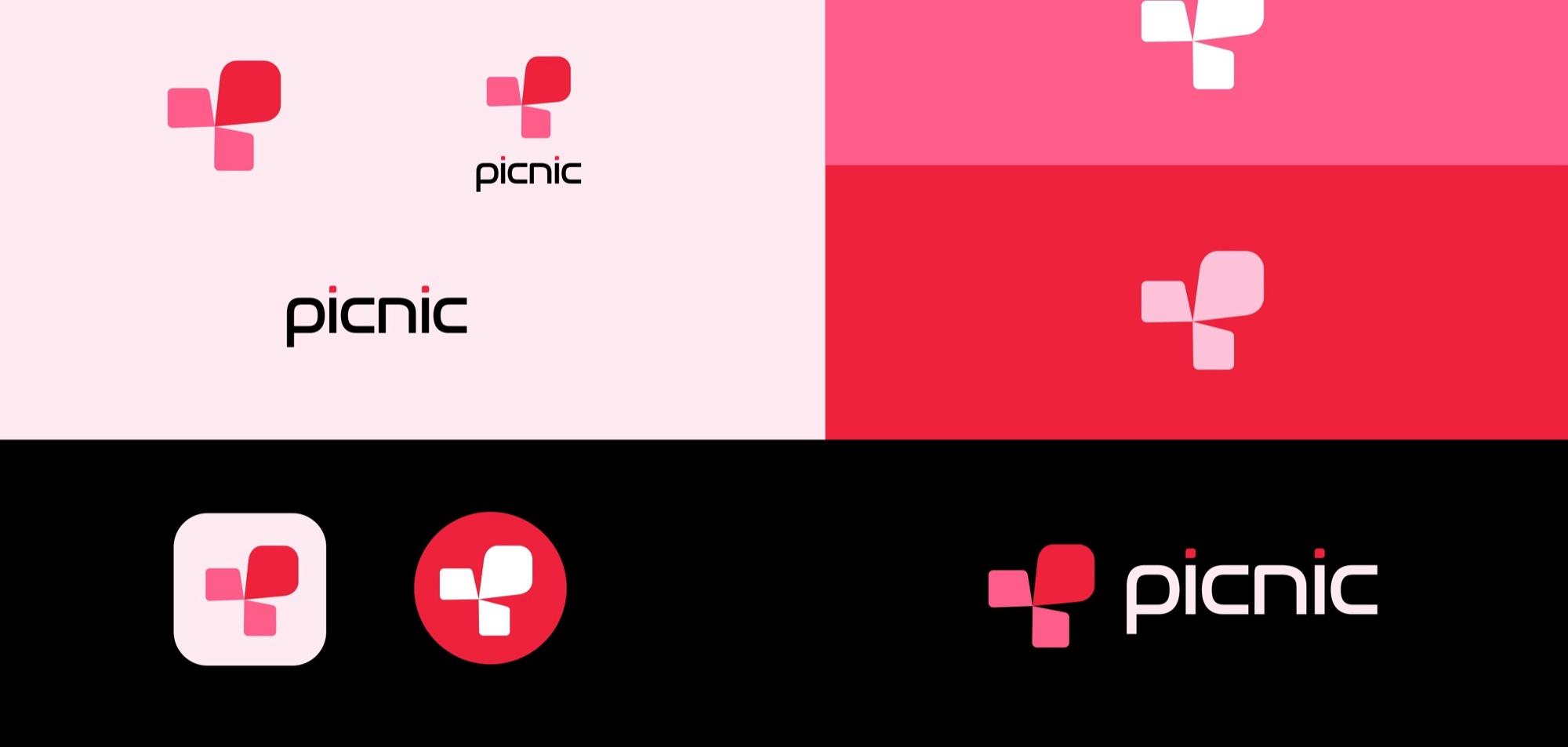
The symbol joins the P of Picnic and of pay with the squares of a picnic cloth: ease, simplicity, fun. The same squares repeat into a pattern. The palette was chosen for two things: difference from competitors and legibility.


Campaign Proposal, application examples
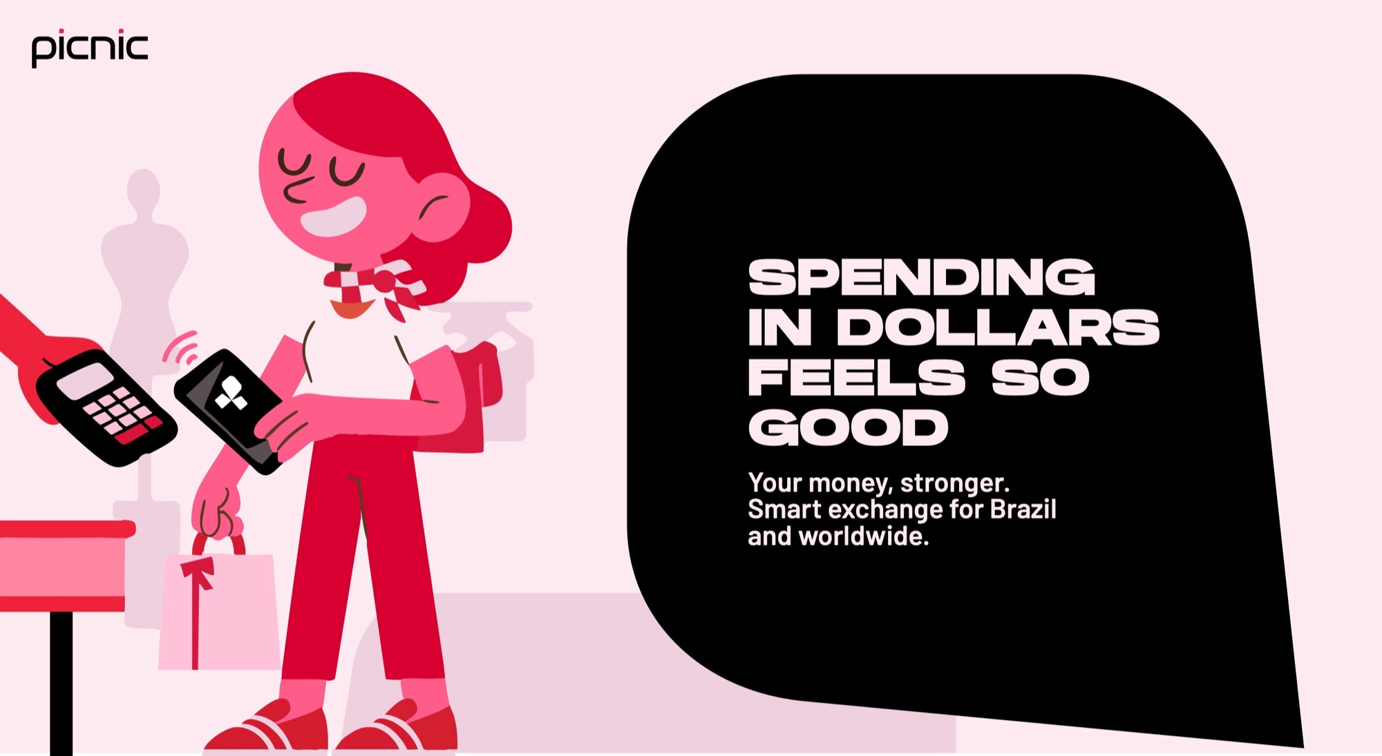
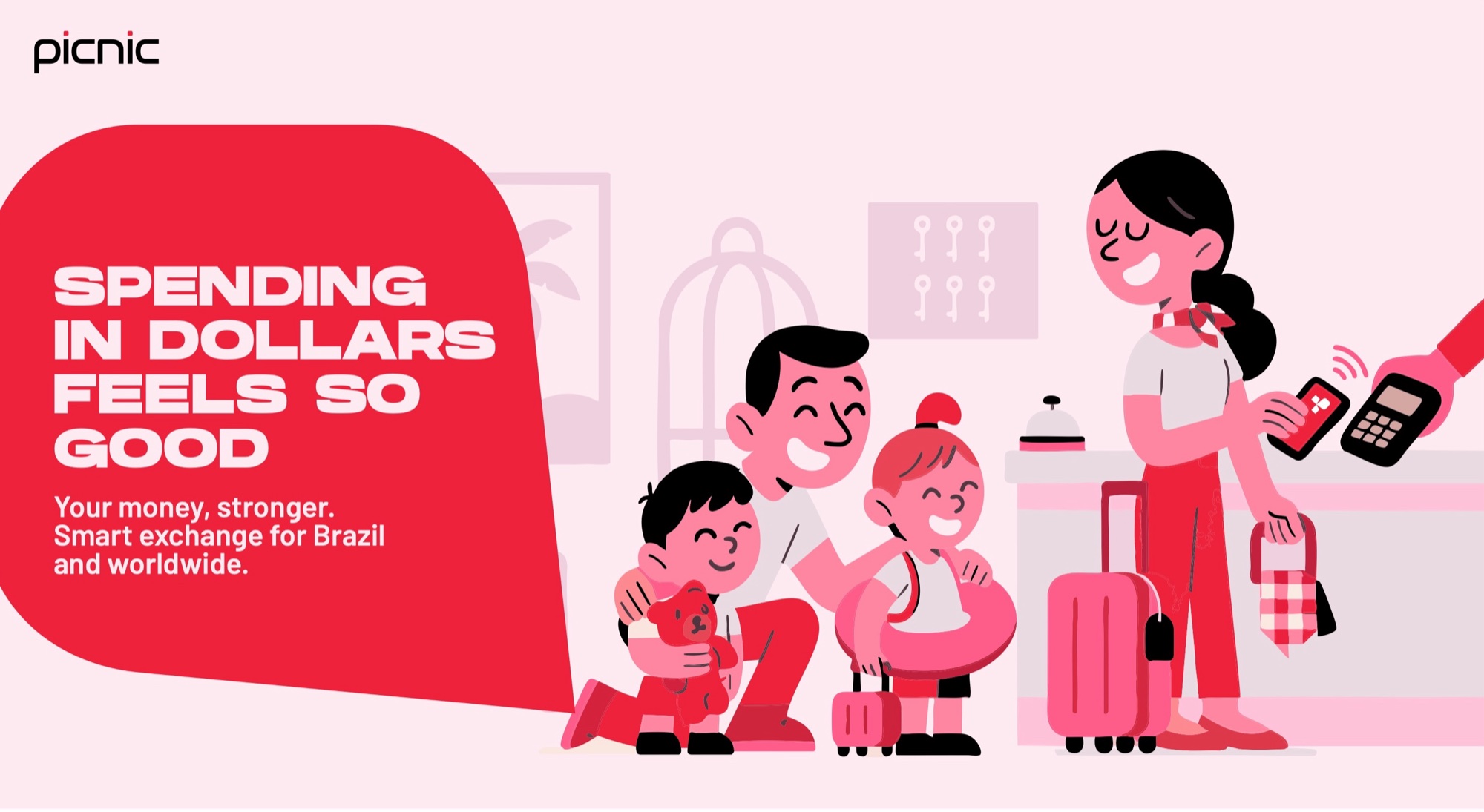
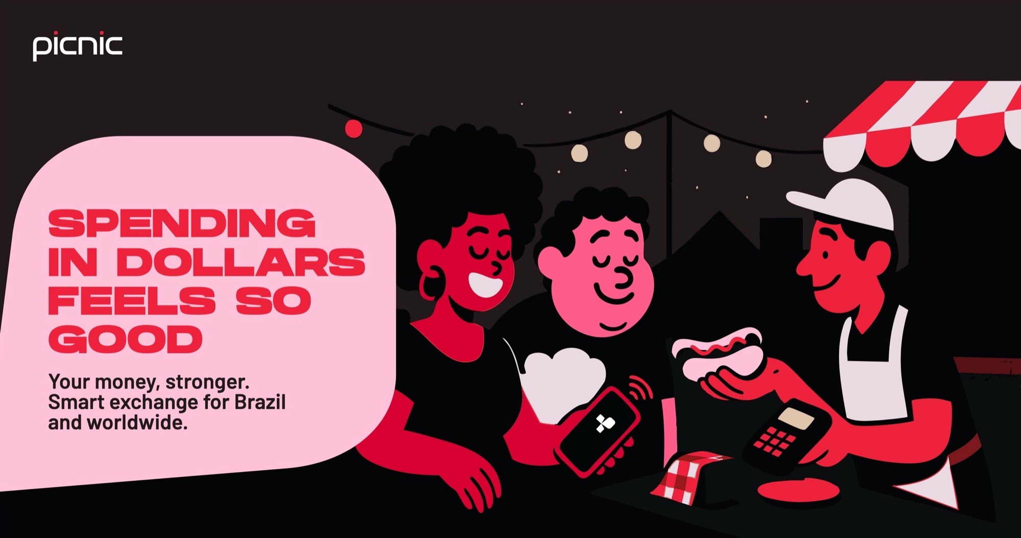
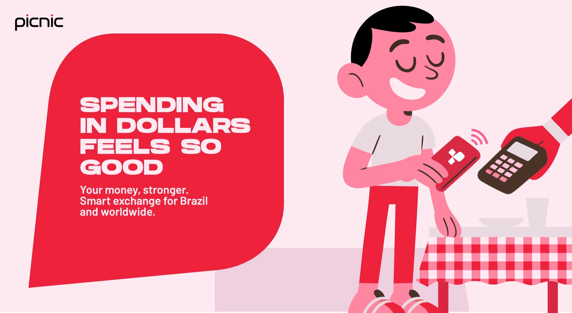
One line, “Spending in dollars feels so good”, runs across a family of illustrated scenes, in English and in Portuguese. These pieces were designed to show how the system applies to marketing.