Joyance
Identity and packaging for a natural perfume house
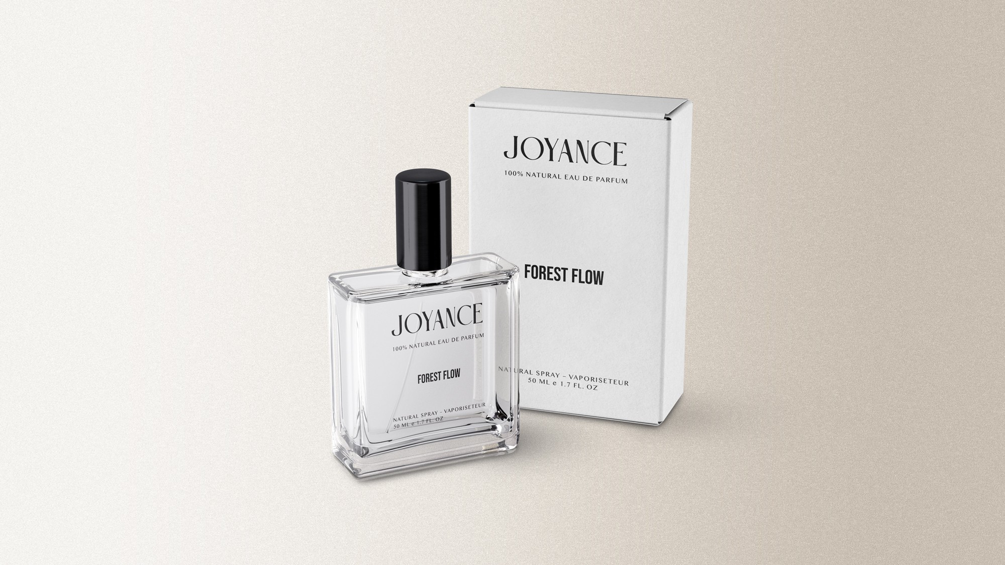
Joyance makes 100% natural eau de parfum in Canada. The identity had to feel as refined as a traditional perfume house while staying honest about what is in the bottle.
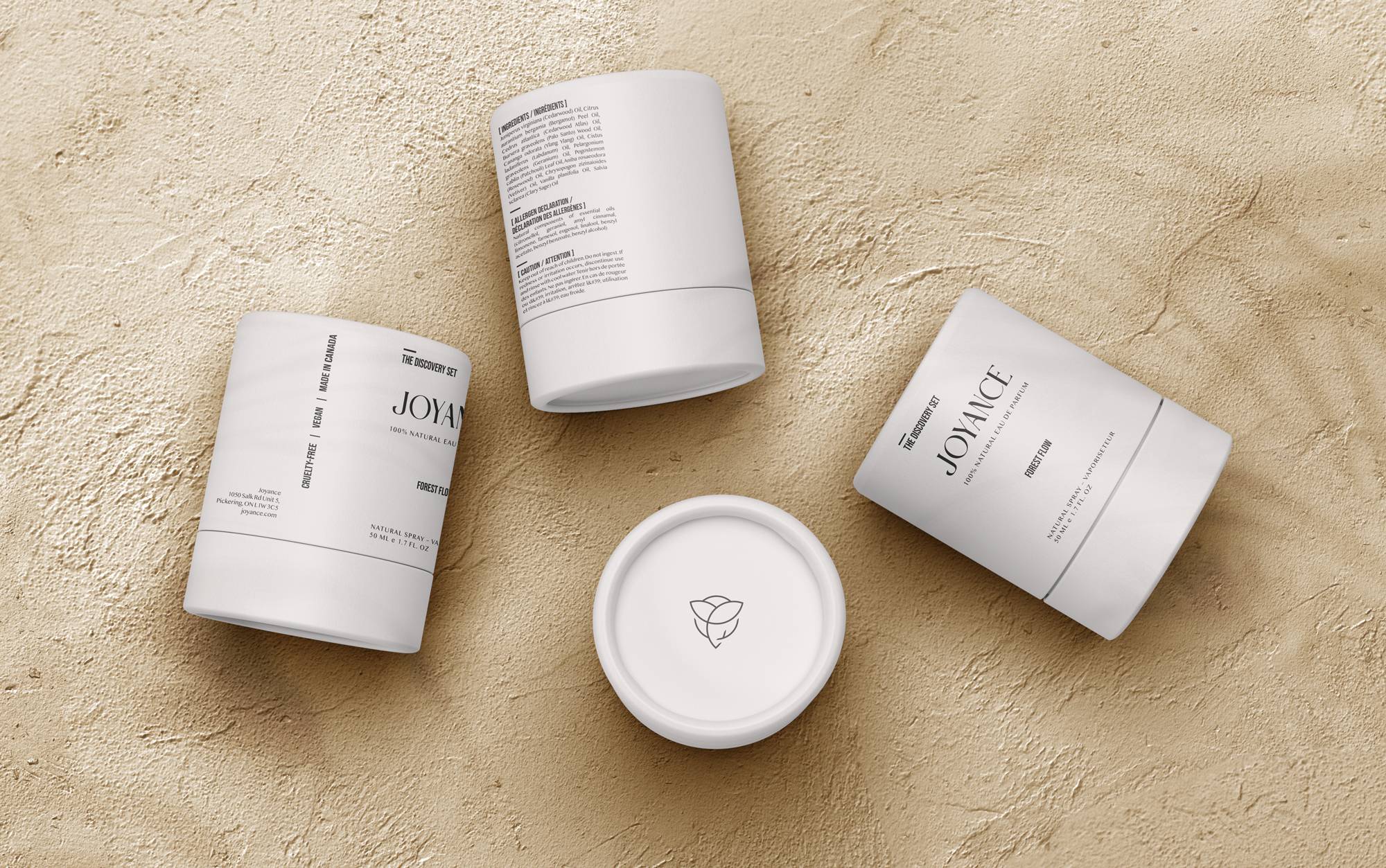
Packaging
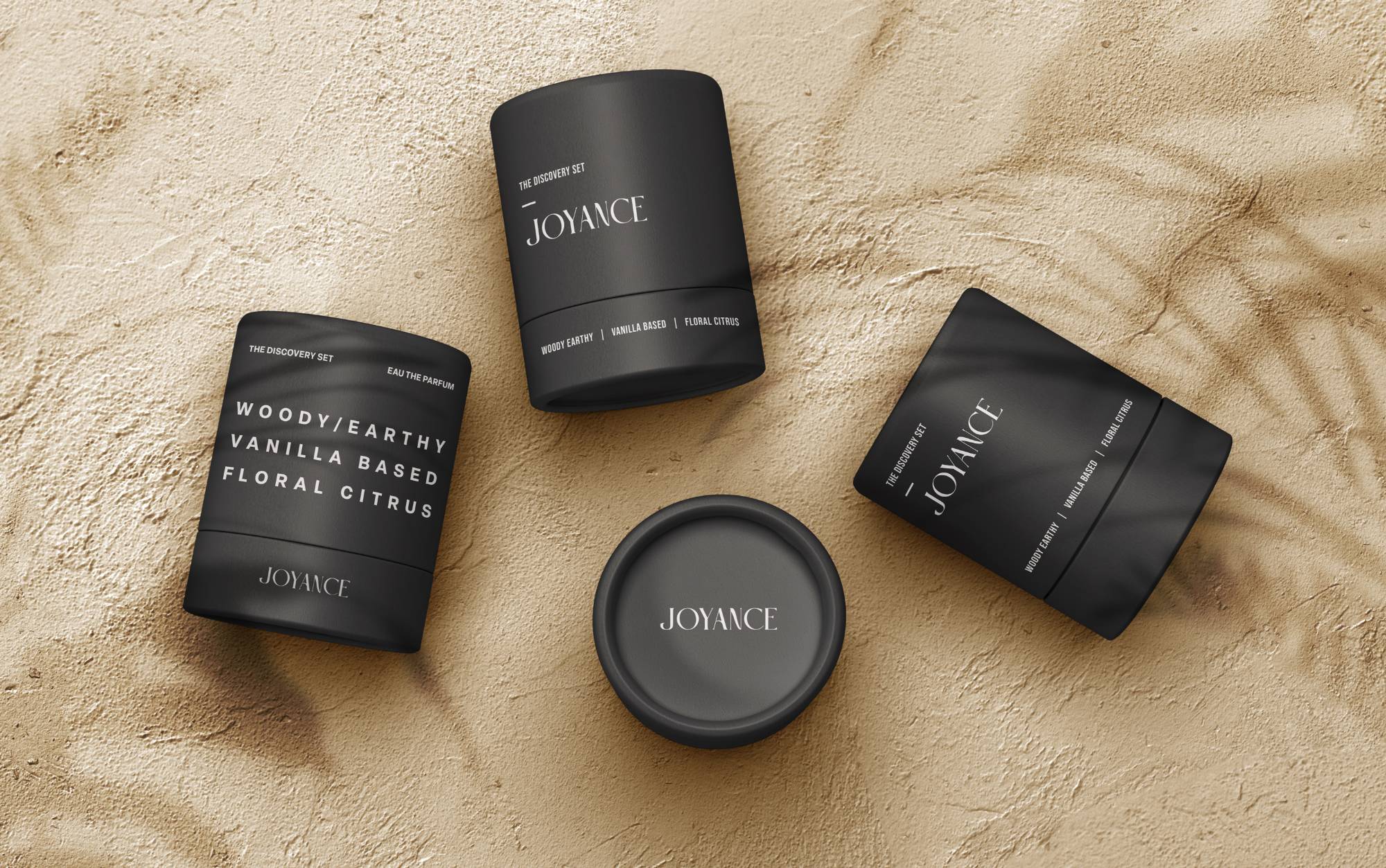
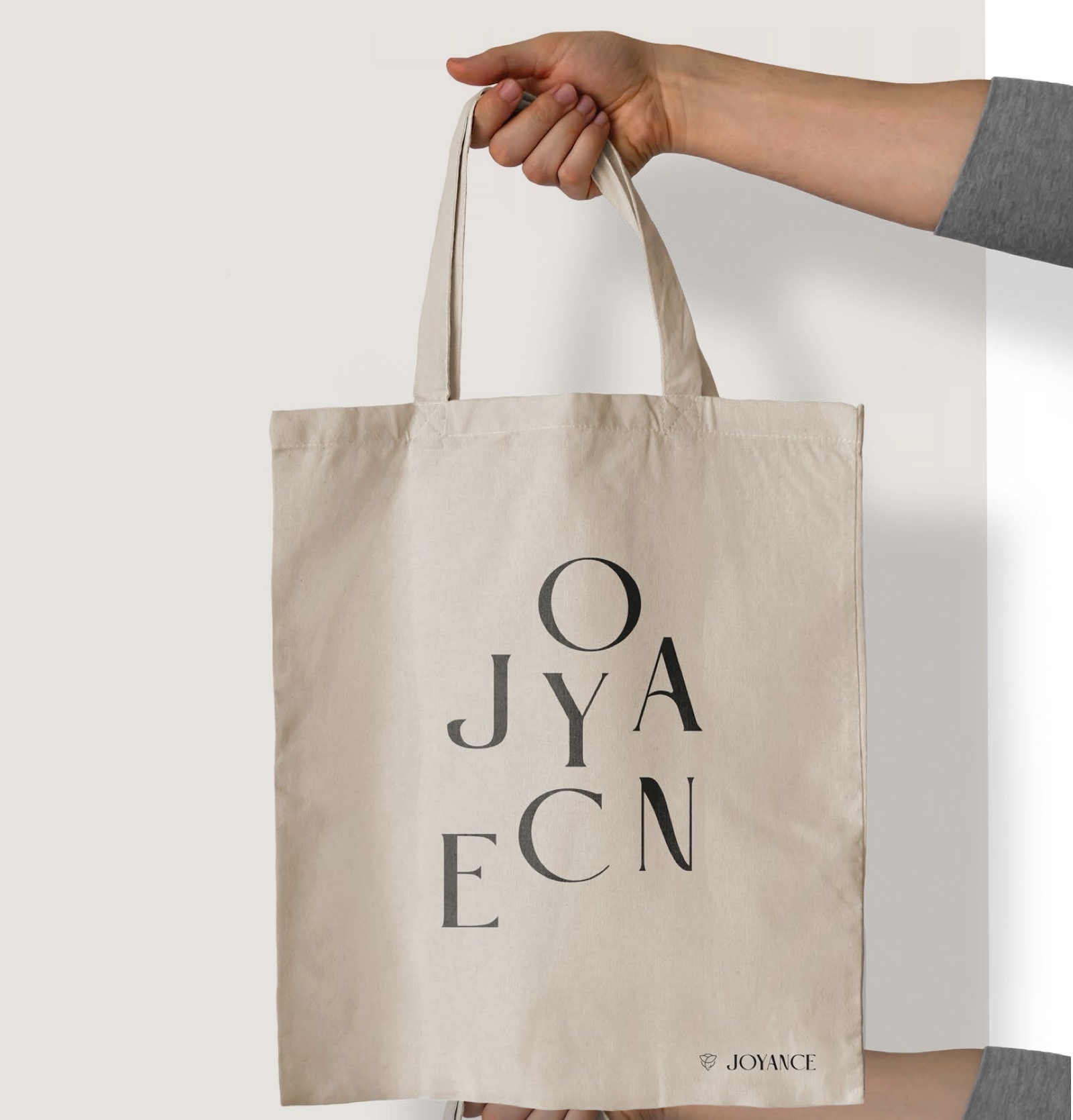
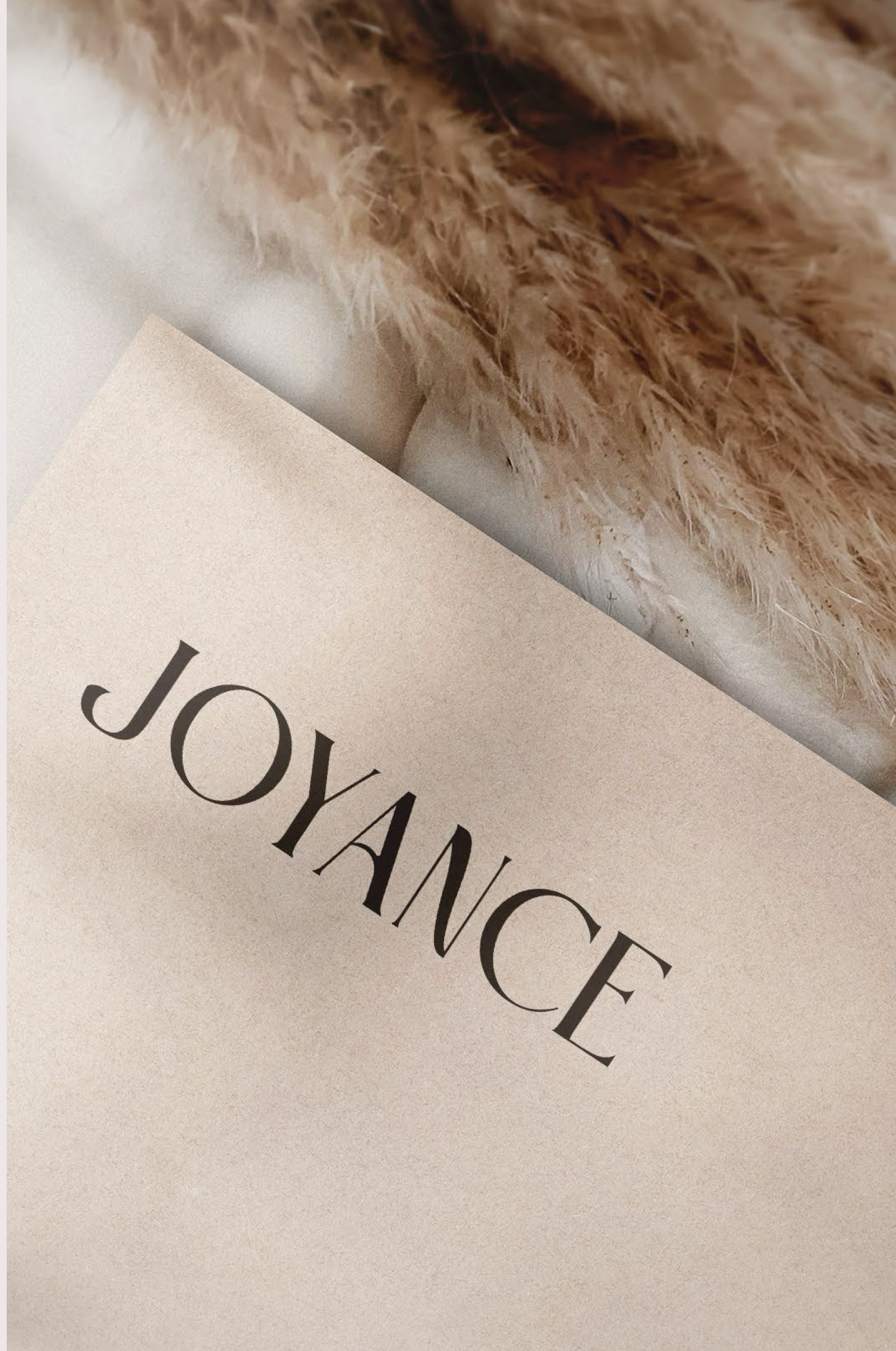
A tall, quiet wordmark and plain typography that puts the scent families first: woody and earthy, vanilla based, floral citrus.
Symbol
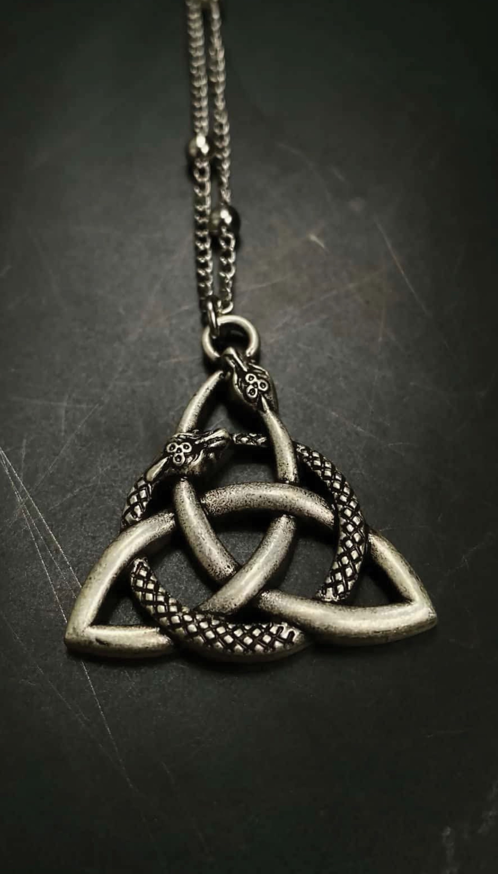
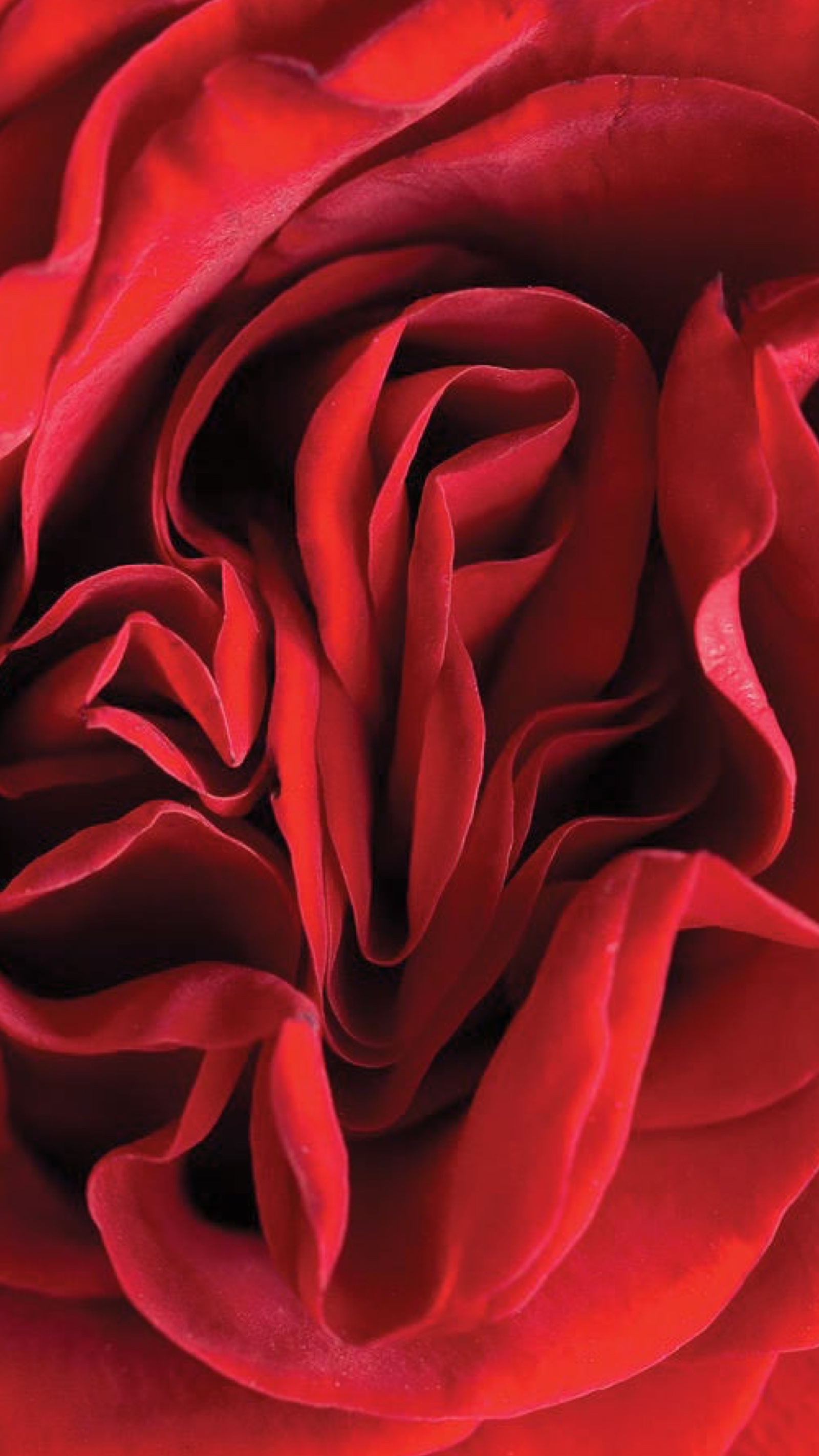
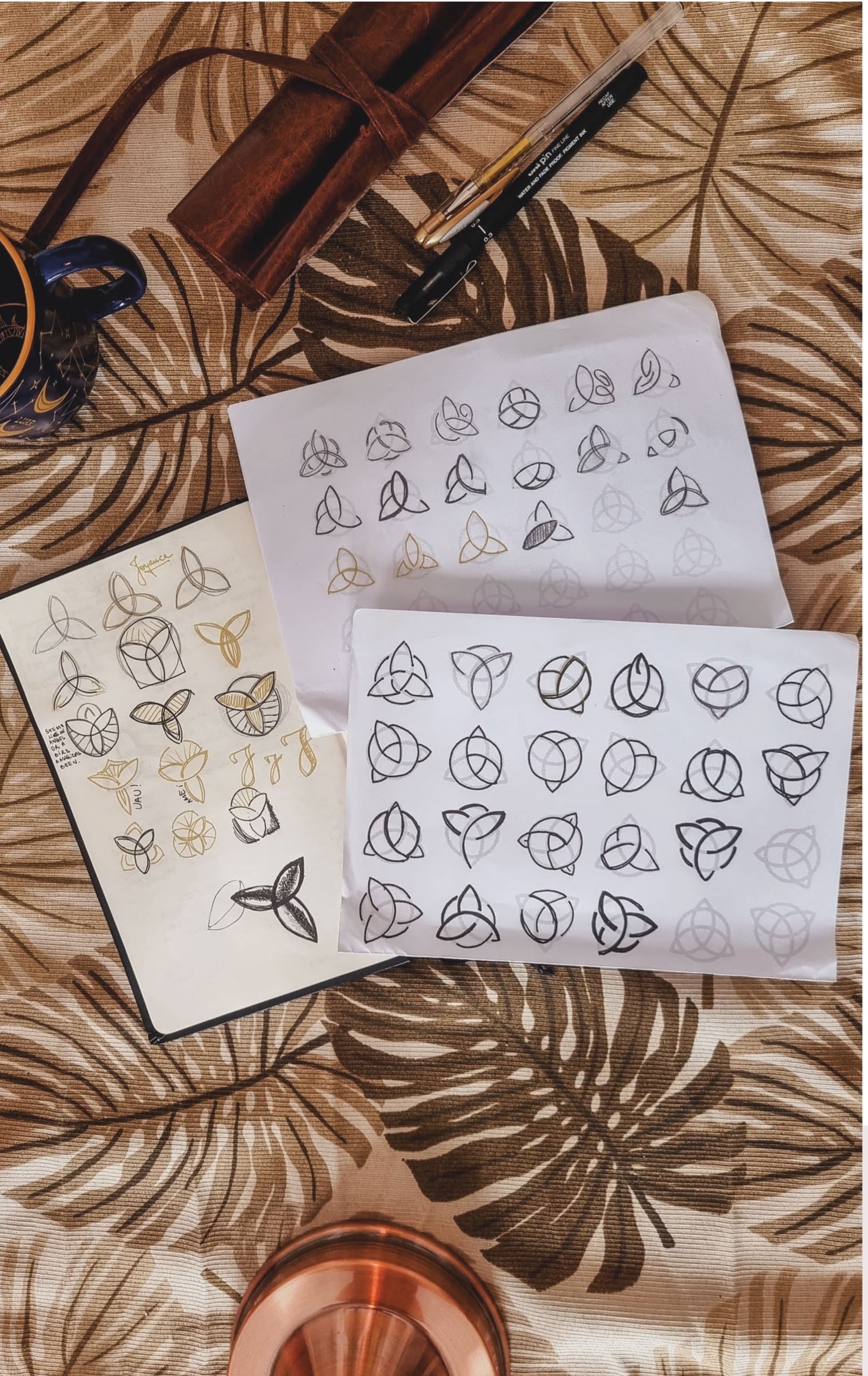
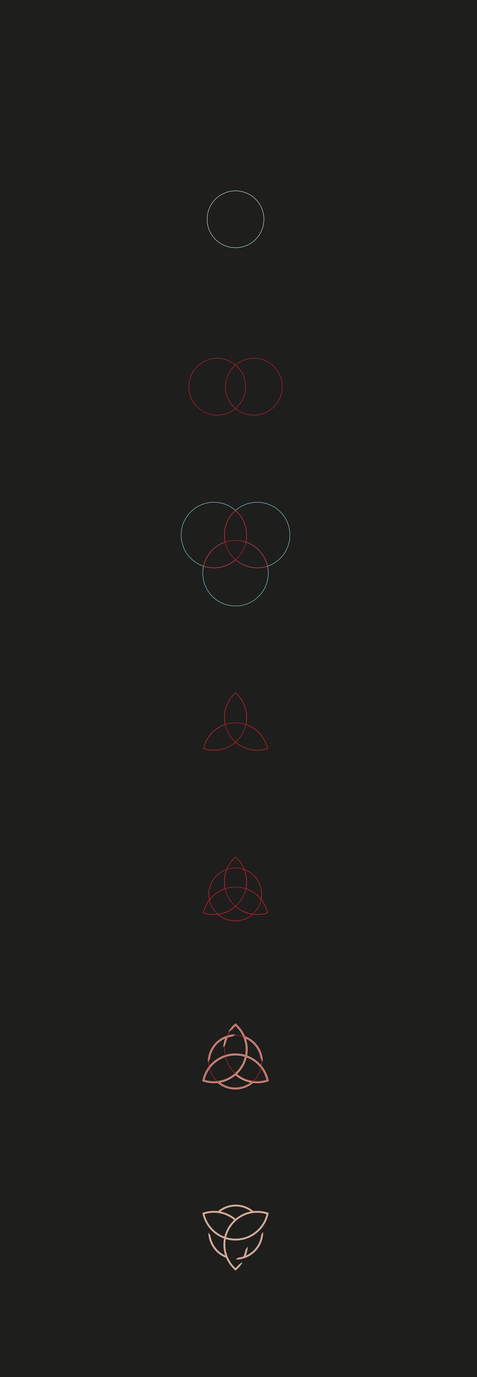
The symbol started from two references, the triquetra knot and the layered petals of a rose. Dozens of hand sketches narrowed it down to a three-leaf knot constructed from circles.
Wordmark and pattern

Explorations Not the final design
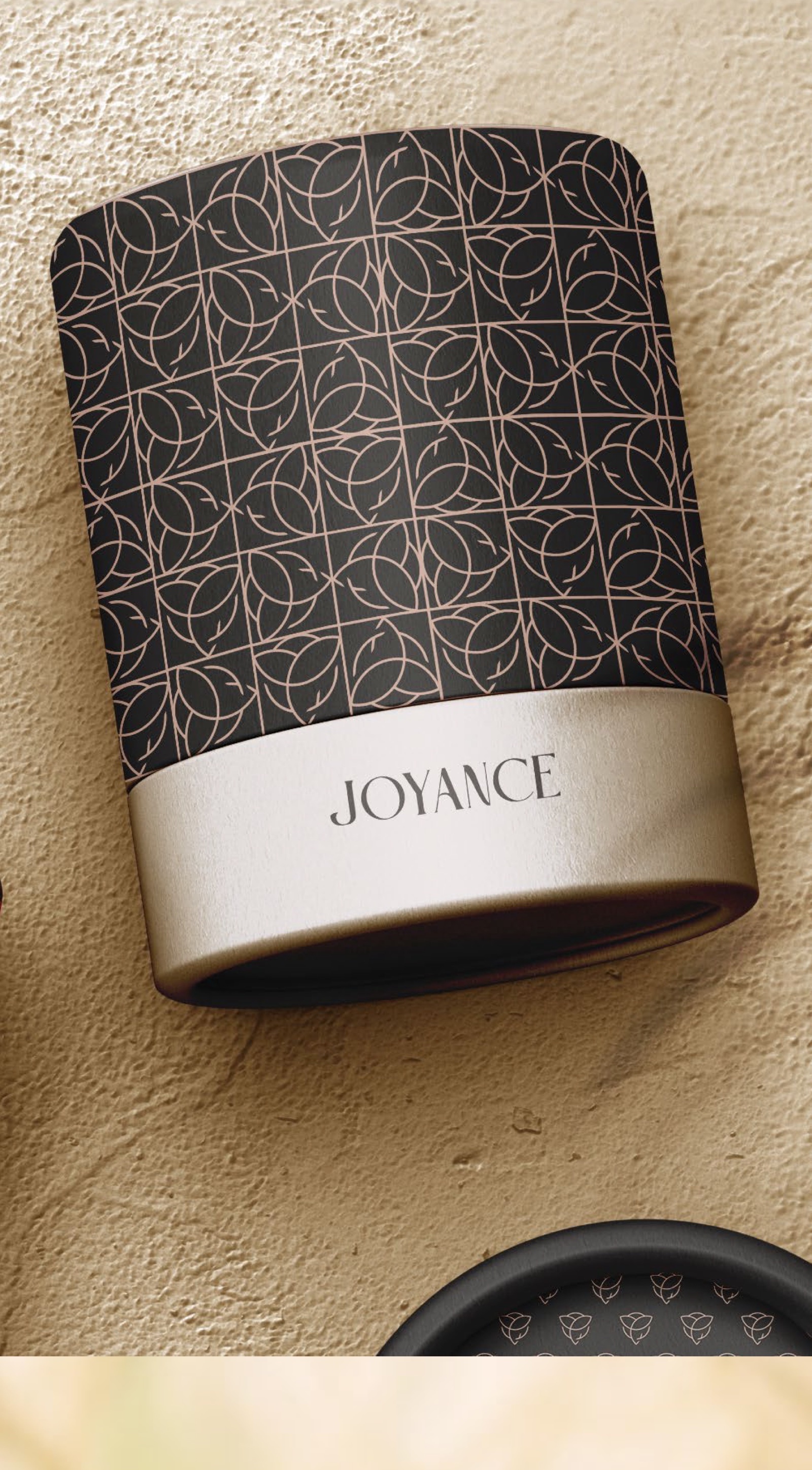
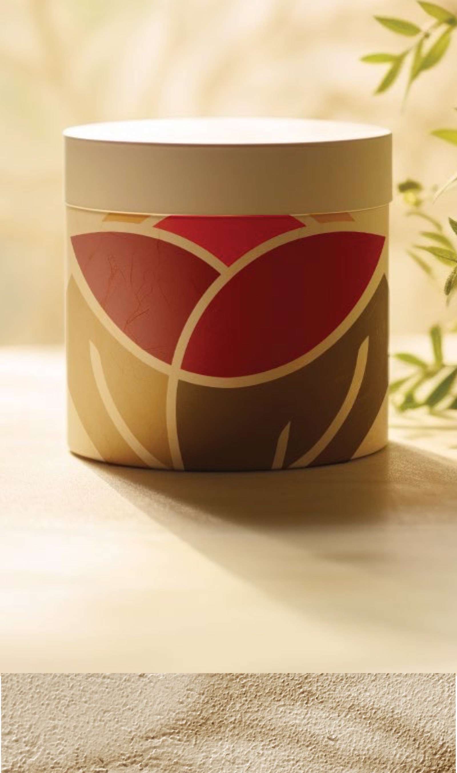
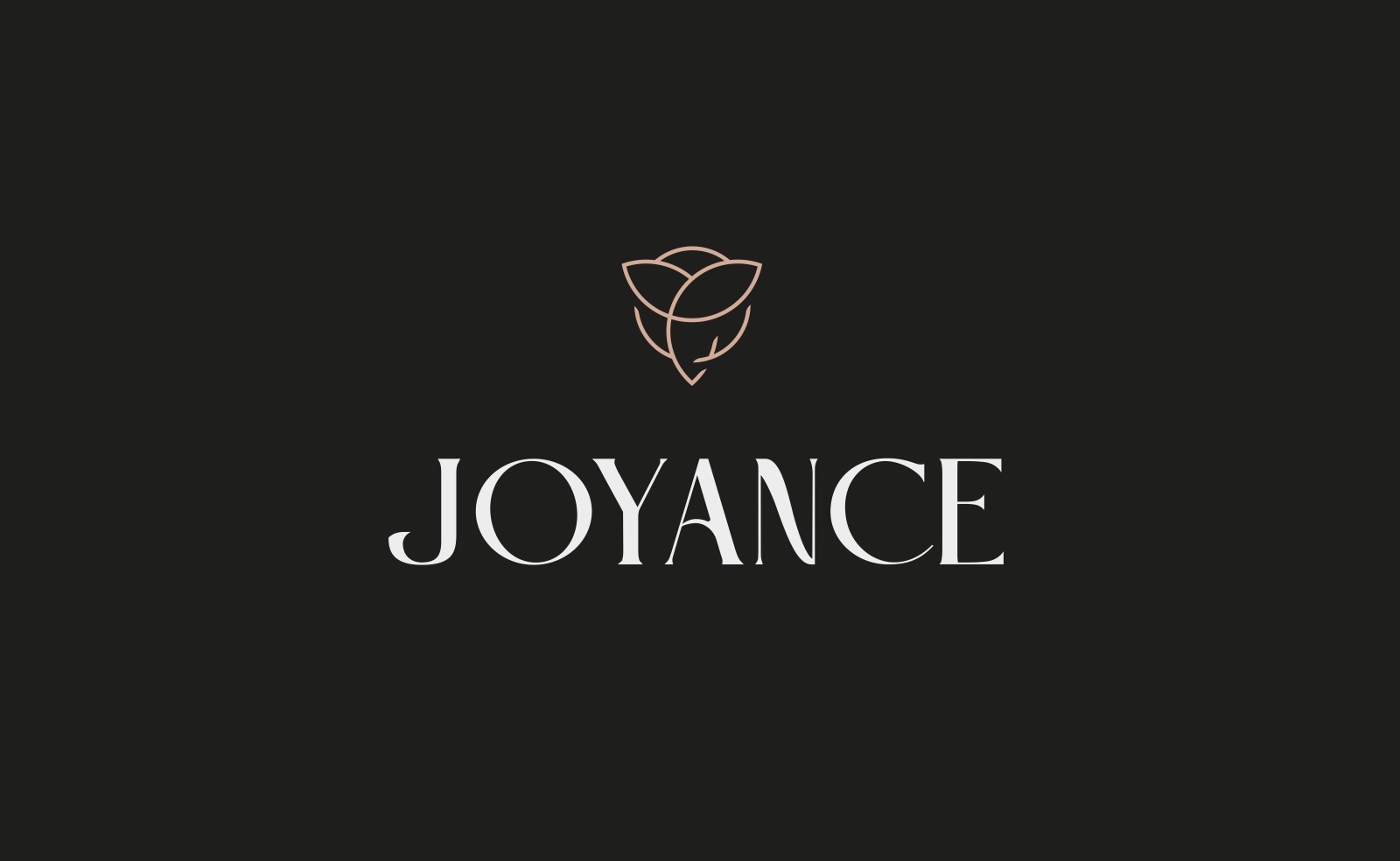
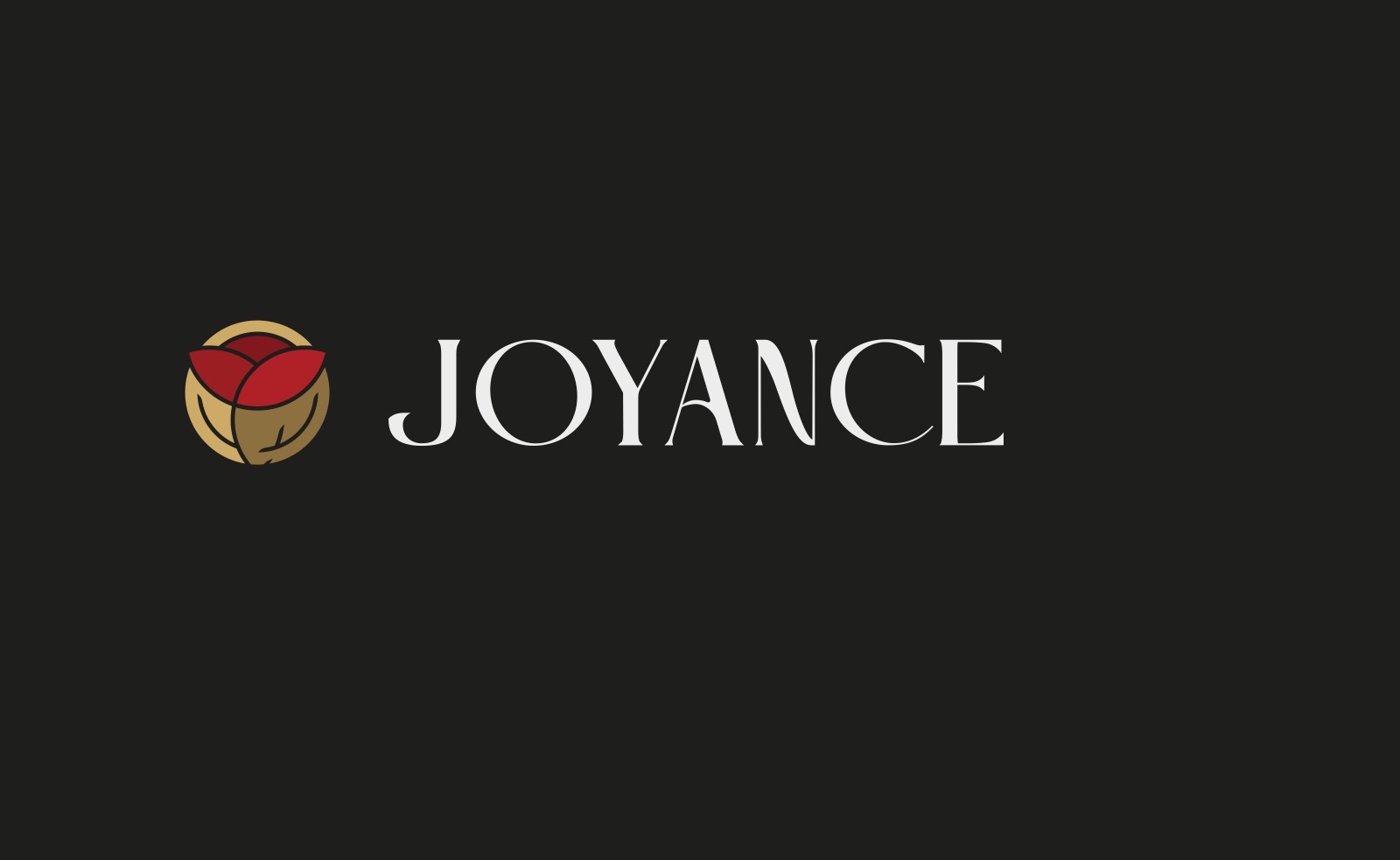
Routes I presented that were not taken forward: black packaging, a stacked wordmark, a leaf grid and the rose in flat colour. The white packaging was the one chosen.